
Branding Case Study
Lavender Lane Landscapes
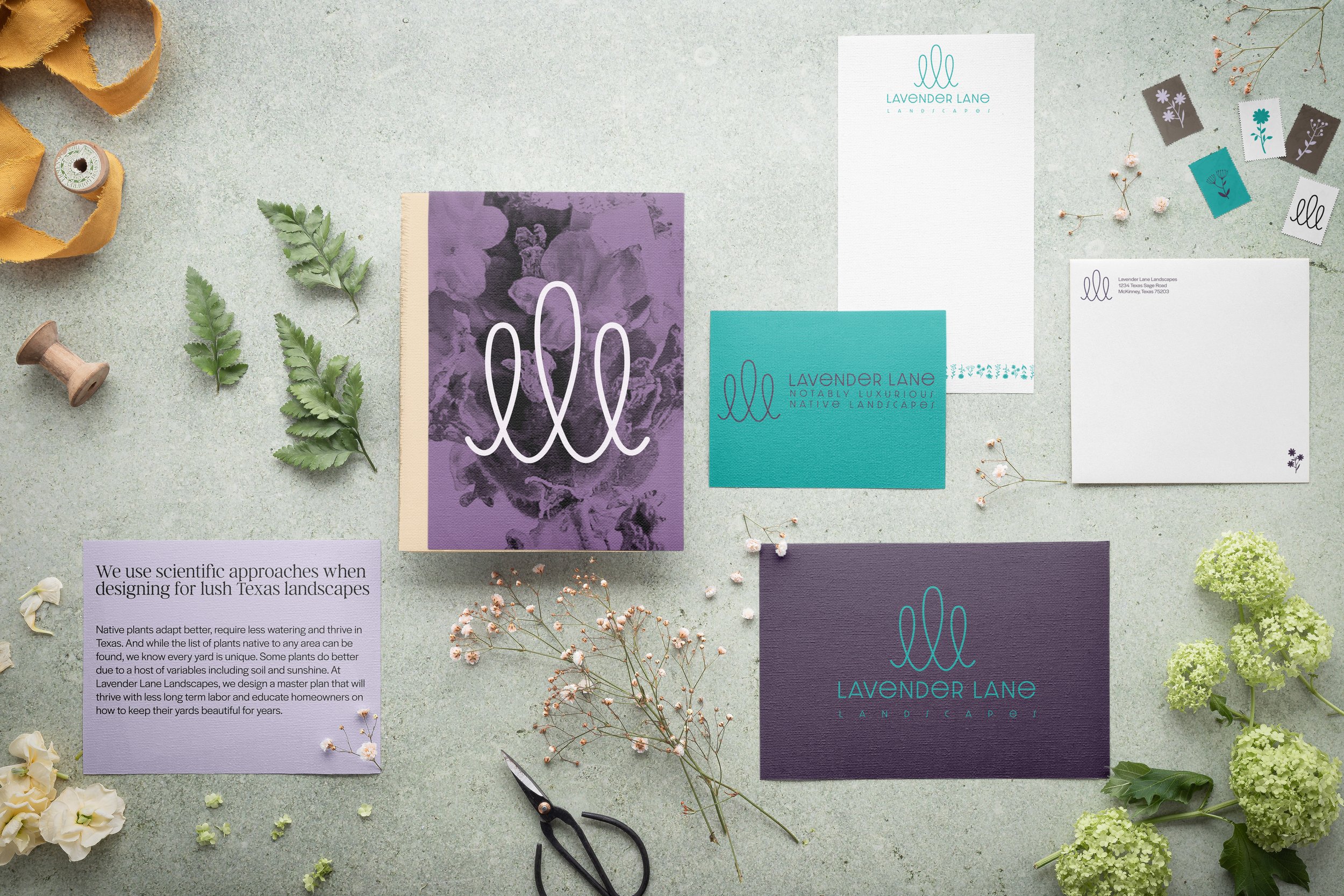
This work with Lavender Lane Landscapes was from the ground up—developing their visual identity and crafting a brand story rooted in purpose, place, and growth. Through collaboration, we built a brand that feels as personal and intentional as the gardens they design.

Texas-born. Native plant fluent. Garden-obsessed.
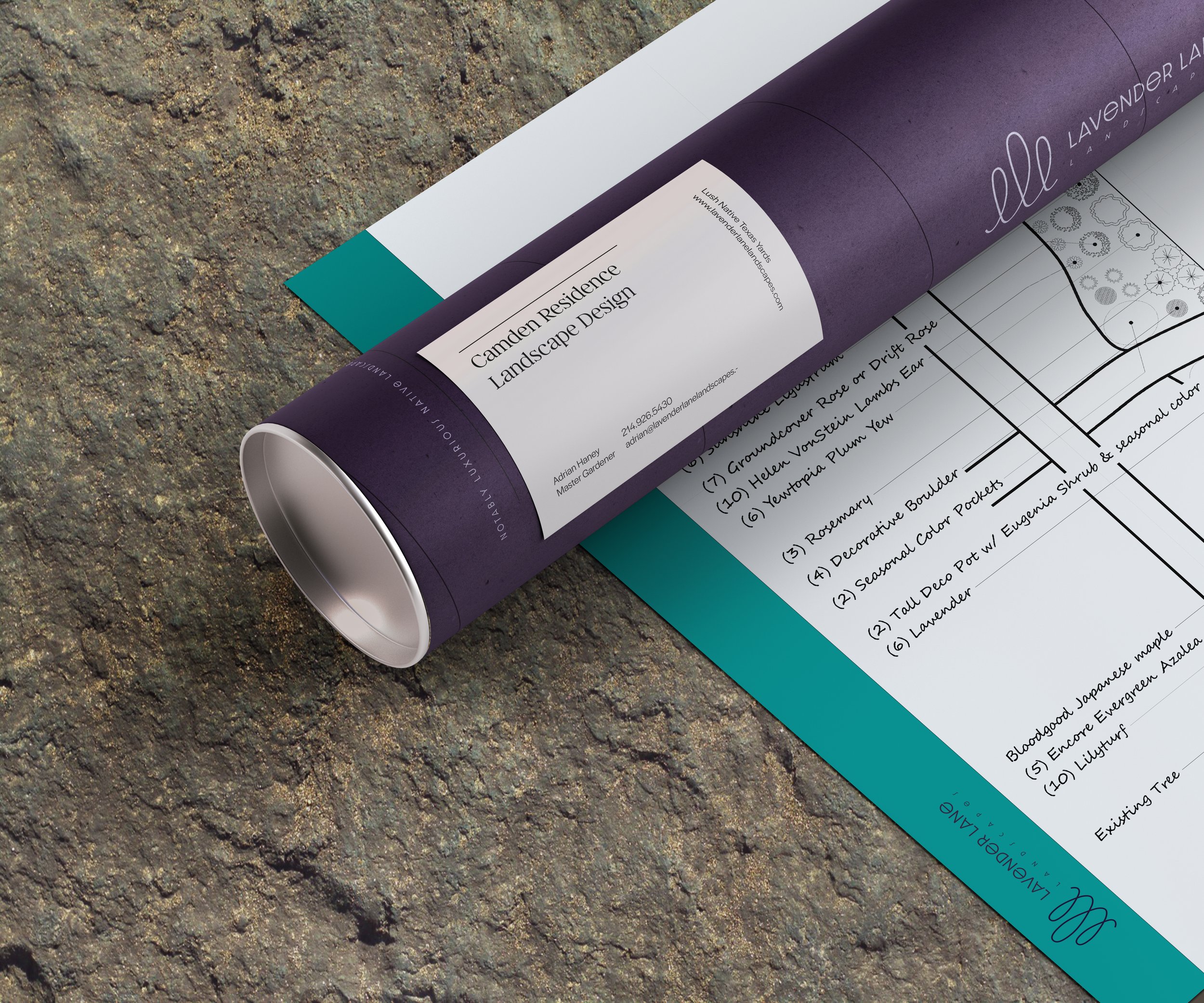
Lavender Lane Landscapes designs outdoor spaces that feel as personal as they are purposeful. With deep roots in sustainable landscape design, they blend university-backed research with real-world experience to help clients thrive in their own yards.
They specialize in native plants, science, and custom plans
to create pollinator havens, food gardens, and peaceful retreats.
More than a landscape company—they grow gardeners.

The brand’s colors—sage and deep lavender—nod to native Texas flora, symbolizing both botanical roots and the quiet wisdom found in tending the land.
The mark’s looping form reflects both the alliteration of the brand’s name and the organic, uneven rhythm of growth—where every plant, like every gardener, blooms at its own pace.